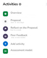
Each collection has its own timeline which provides an overview of the completed activities, upcoming deadlines, and received feedback.
The timeline is visible on the left side of your screen or collapsed behind the menu button on smaller screens.
This guide goes into further detail about the possible structure of the timeline, how to recognize specific activity types, as well as how to navigate the timeline.
Example of a simple timeline
This example contains a timeline of the following activities (in order):- The start of the assignment. This contains information like the description, due date, and possible points.
- A graded entry, which can be identified by the checkmark.
- Three ungraded entries, of which the first one is selected, hence the black background.
- An unfilled deadline. The student did not provide any content for this entry.
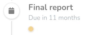
The due date is also passed, but not yet the lock date, hence the orange clock. - An upcoming deadline. The student did not provide any content for this entry, but the due date is also not passed which can be identified by the "in 7 days" and the calendar icon.
- New activity button. The student is allowed to add an entry to their collection. This is done via this button. This is not visible for teachers.
- A progress goal. The teacher expects students to have acquired 10 points in 12 months.
- A peer feedback moment. After the goal has been achieved, the teacher expects students to provide peer feedback over their collection.
- The end of the assignment. This contains the due or lock date of the assignment. This also contains the overall assessment if the teacher created one.
¶ Collection overview
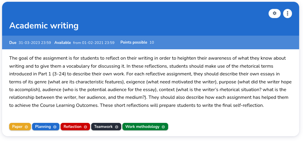
Each timeline always starts with an overview of the collection/assignment. This is indicated by the icon.

The overview contains the following information:
- Description: an overall description of the assignment, optionally combined with attachments;
- Points possible: the number of points that represents a perfect score;
- Unlock date: the moment from which students can work on the assignment;
- Due date: the moment when students are expected to finish the assignment;
- Lock date: the moment from which students can not work on the assignment anymore;
- Categories: each of the categories that play an important role in this collection.
¶ Activity type indication
A timeline can contain various types of activities, each indicated with a different icon and/or label.
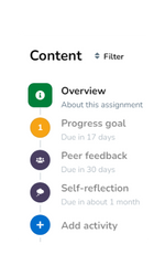
This example shows a timeline with three different activities types.
- A progress goal, indicated by an orange circle and the number 1 indicates the number of points that should be obtained to complete this goal.
- A peer feedback activity.
- A self-reflection activity.
You may notice that the bottom of this example shows the ability to add an activity to the timeline.
¶ Ordering timeline content
By default, new content in the timeline is ordered by date or submission (or due date if no submission exists yet). If you want to, you can change the viewing order of the timeline content by clicking on the current sort method. In the assignment editor (as a teacher) or in your own collection (as a student) it is also possible to manually order the content as you wish, independent of submission or due date.
¶ Entry
Entries are the most common activities. These contain the content that a student provided and are easily identified by their white background. The icon inside the circle represents the state of an entry, which is discussed below.
¶ Entry activity status
This section explains each of the statuses an entry might have and how it can be identified (in order of progression):
- Unfilled: A deadline that the student still has to fill in.
- Drafts: (students): Students can work on their entries within eJournal. Until the entry is submitted, they are not visible to the teacher. A draft is displayed by a blue banner below the activity name and date.
- Needs grading: (teachers): A submitted entry which a teacher needs to grade.
- Needs publishing: (teachers): This is displayed when a teacher graded the entry but did not yet publish it for the student to see.
- Awaiting grade: (students): After a student submits their entry, they are awaiting their grade.
- Evaluated: Evaluated entries appear with a green checkmark.
- Evaluated with evaluation method icon: Evaluated entries appear with a corresponding icon if the evaluation method has one. For example this award icon.
¶ Adding new entries
Students can add entries by filling in preconfigured intermediate deadlines,
or by adding a freely usable template to their timeline
using the button in the timeline (see below).

¶ Progress goal
The yellow activities are progress goals. These are configured by the teacher, and represent a goal for students to achieve.
In the timeline, you can see the number of points that need to be reached by the number inside.

¶ End of assignment
The end of the timeline contains the due and lock date of the assignment. If a teacher publishes an overall assessment, this can be also found here.
¶ Filtering the timeline
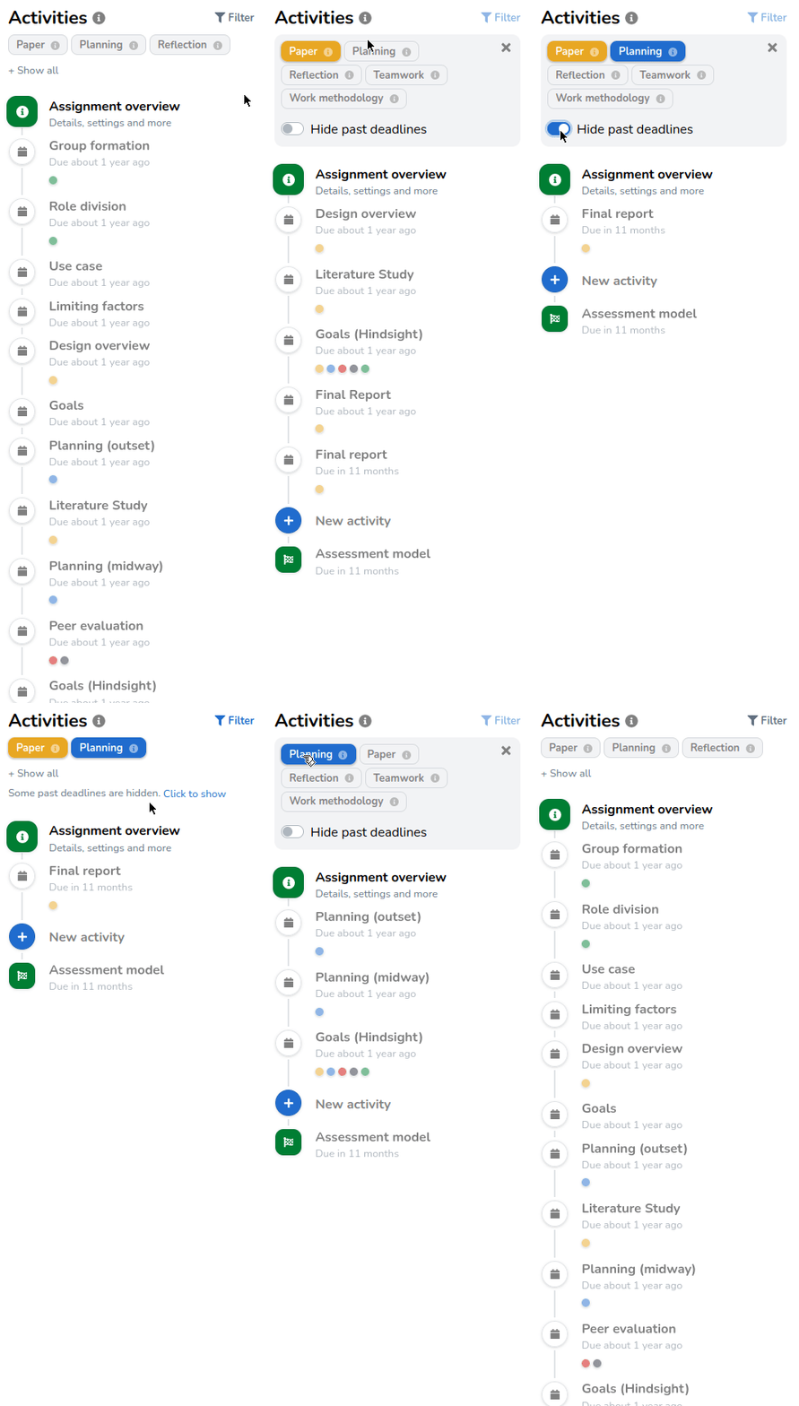
Above the activities in the timeline, there is a menu to filter the timeline which can be opened by clicking on the filter icon. This can be useful for larger timelines.

- Hide past deadlines: This hides any deadline without an entry that has passed. This allows you to exclude activities that are no longer useable.
- Filter by category: Select only the categories that you would like to see.
Show me what filtering the timeline looks like
